USA Hockey
Registration form website
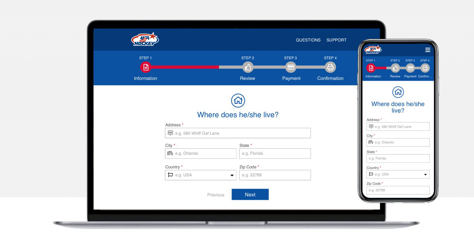
Project brief
This project is about redesigning the registration form for US hockey classes for children and teenagers. The form is outdated and the client wants to modernize and make user friendly.
Problem
Some users have complain about the tedious process to register their children to the hockey classes. Some users might even drop the registration impacting the incomes of the organization.
Solution
Redesign the form to improve the experience by making it responsive for mobile devices, user friendly, reduce the fields and make the registration process less painful and efficient.
Target audiance
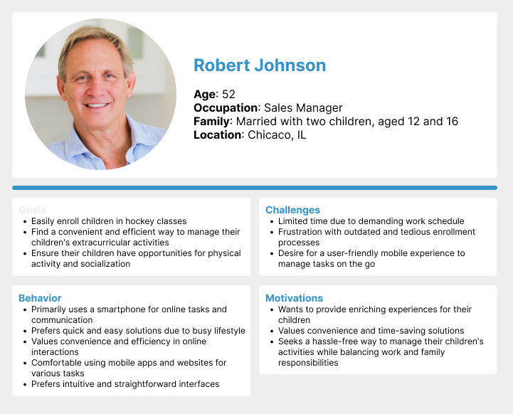
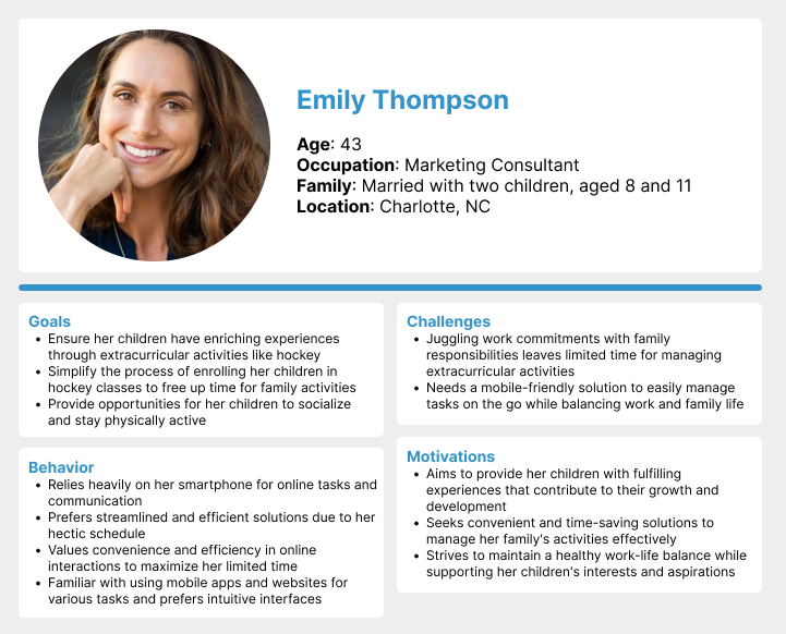
Parents in middle age parents of children aged 6 to 20, typically busy individuals with the resources to afford the classes but a busy schedule. Prefer mobile devices for convenience.
Scope
The project scope involves redesigning the registration form interface to enhance responsiveness, intuitiveness, and user-friendliness. While simplifying the process, it\’s essential to retain necessary fields for class enrollment.
Discovery and Research
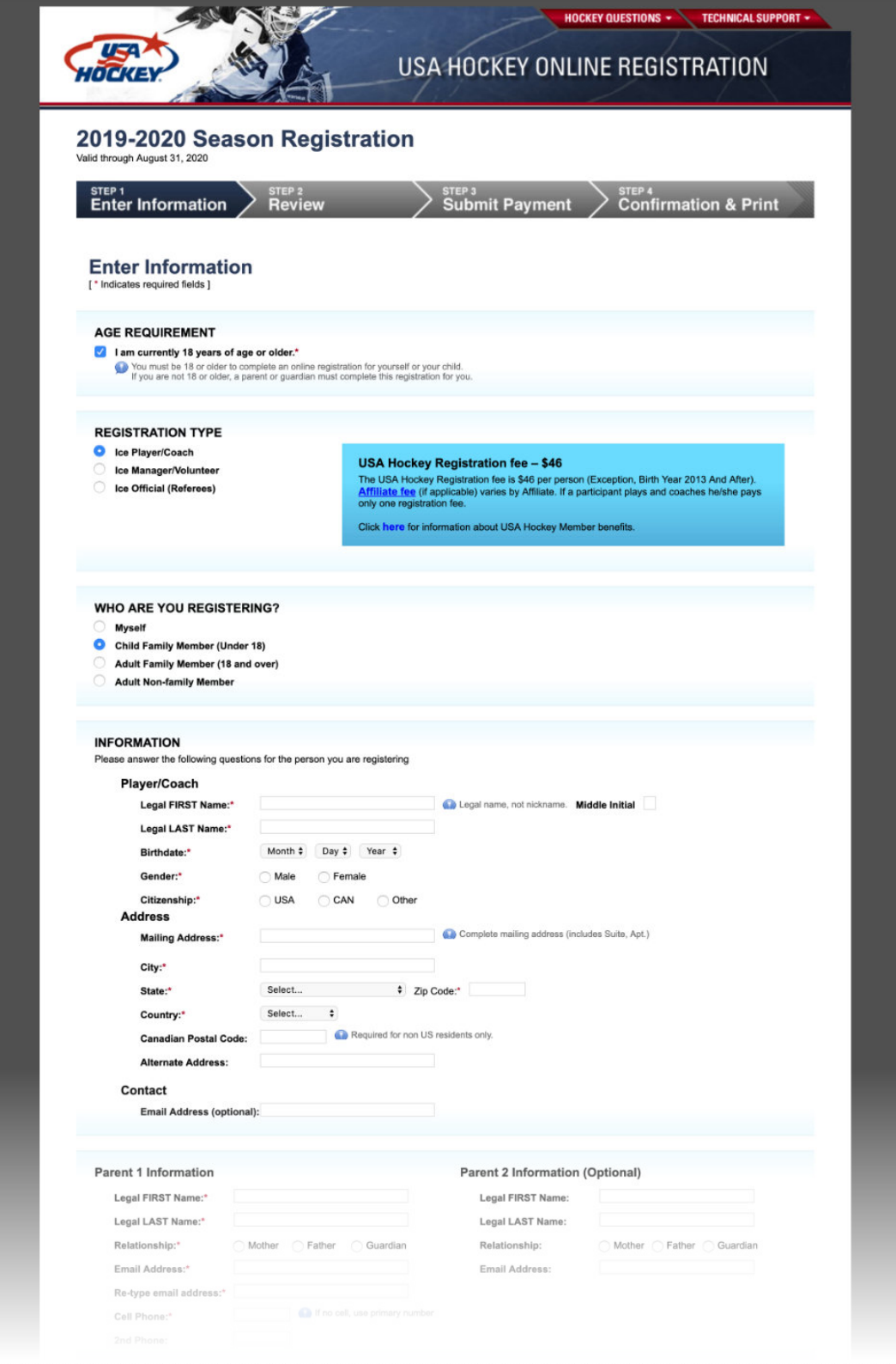
Previous version
I reviewed the existing form, get familiarized with the information to understand what is they key information needed, the possible escenarios and what is the existing experience overall.
It was designed like a decade ago when the mobile devices where not that prominent, most of the user would access from desktop devices.
User research
The client said they wanted to improve the user experience by reducing the time, make it user friendly and accessible from mobile devices.
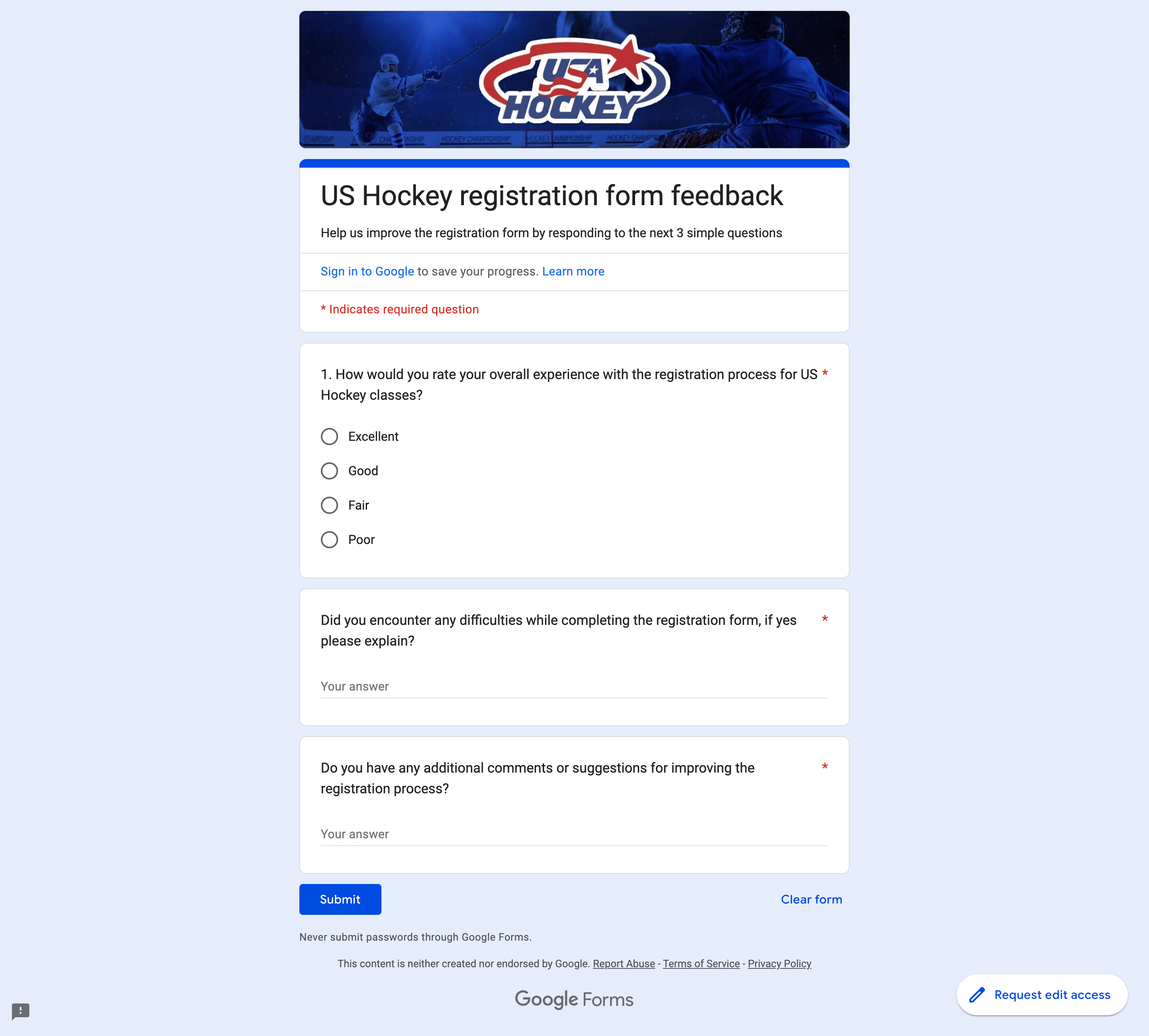
In order to identify what could help to improve the experience, make it user friendly and even reduce the time, I made a short survey in Google Forms and sent the link by email. The client provided the emails of 50 individuals whom registered in the past, from those a total of 37 took the survey.
The questions where these:
- How would you rate your overall experience with the registration process for US Hockey classes?
- Did you encounter any difficulties while completing the registration form, if yes please explain?
- Do you have any additional comments or suggestions for improving the registration process?
Survey results
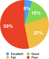
The results of the survey showed that indeed most of the users had a bad experience during the registration process. From the results I also identified 3 recurrent paint points or complains which became the areas to improve
Overall satisfaction
1. Small text
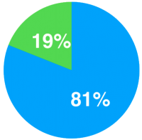
81% said the text is
very small
2 .No mobile friendly
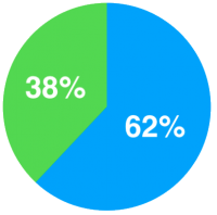
62% said It doesn’t
work in phone
3. Time-consuming
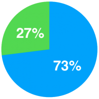
73% said the registration
takes too long
From the survey I established the following:
Objectives:
- Improve Accessibility: Develop a user-friendly registration platform accessible across devices, with a focus on mobile phones.
- Enhance User Experience: Simplify the registration process to reduce stress for users while ensuring essential information is collected.
- Increase Efficiency: Optimize the platform to streamline registration and administrative tasks for users and administrators.
- Foster Engagement: Create a seamless and engaging registration experience to encourage increased enrollment.
Challenges:
- Balancing Information: Simplifying the registration form while ensuring essential fields are included.
- Mobile Optimization: Adapting the platform for mobile devices without sacrificing usability.
- User Engagement: Encouraging efficient completion of the registration process for busy parents.
Requirements:
- Responsive Design: Ensure the platform is functional across devices, including mobile phones.
- Simplified Interface: Create an intuitive and streamlined registration process.
- Essential Fields: Retain necessary information while minimizing user friction.
- Mobile-Friendly: Optimize the platform for use on smartphones and tablets.
- User-Centric Approach: Prioritize user feedback to iteratively improve the registration process.
Define and Ideate
User Personas
Solutions
Friendly questions
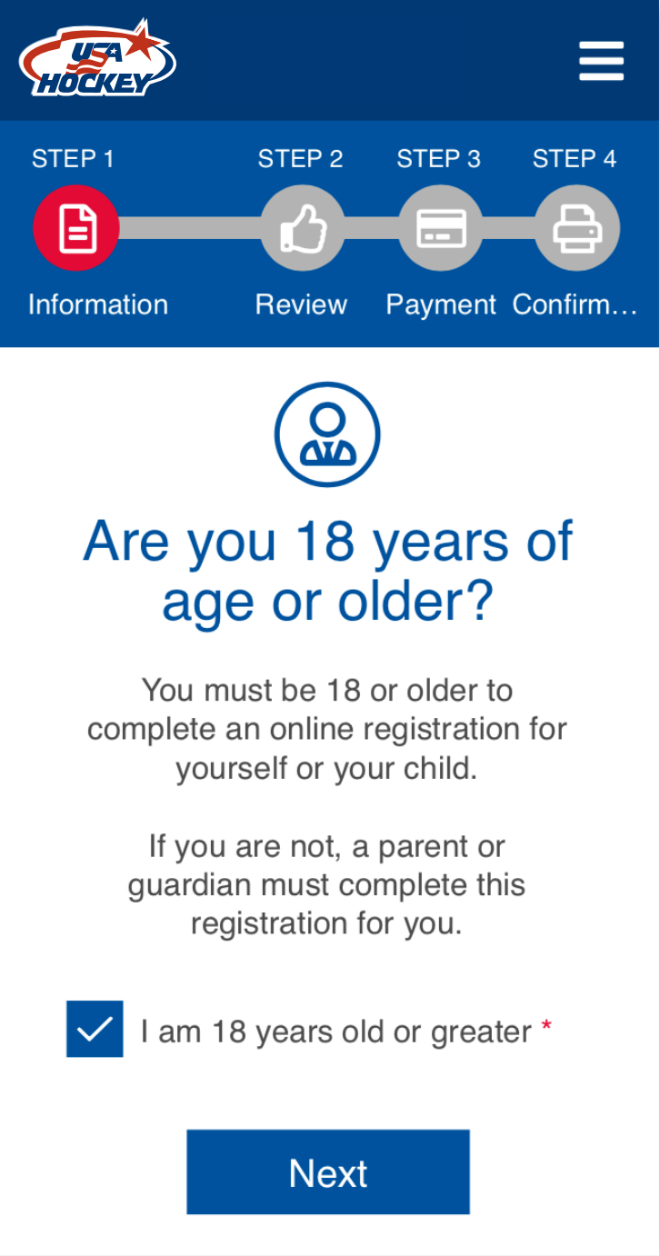
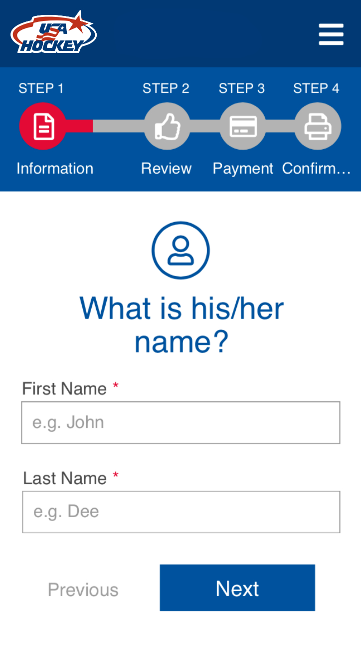
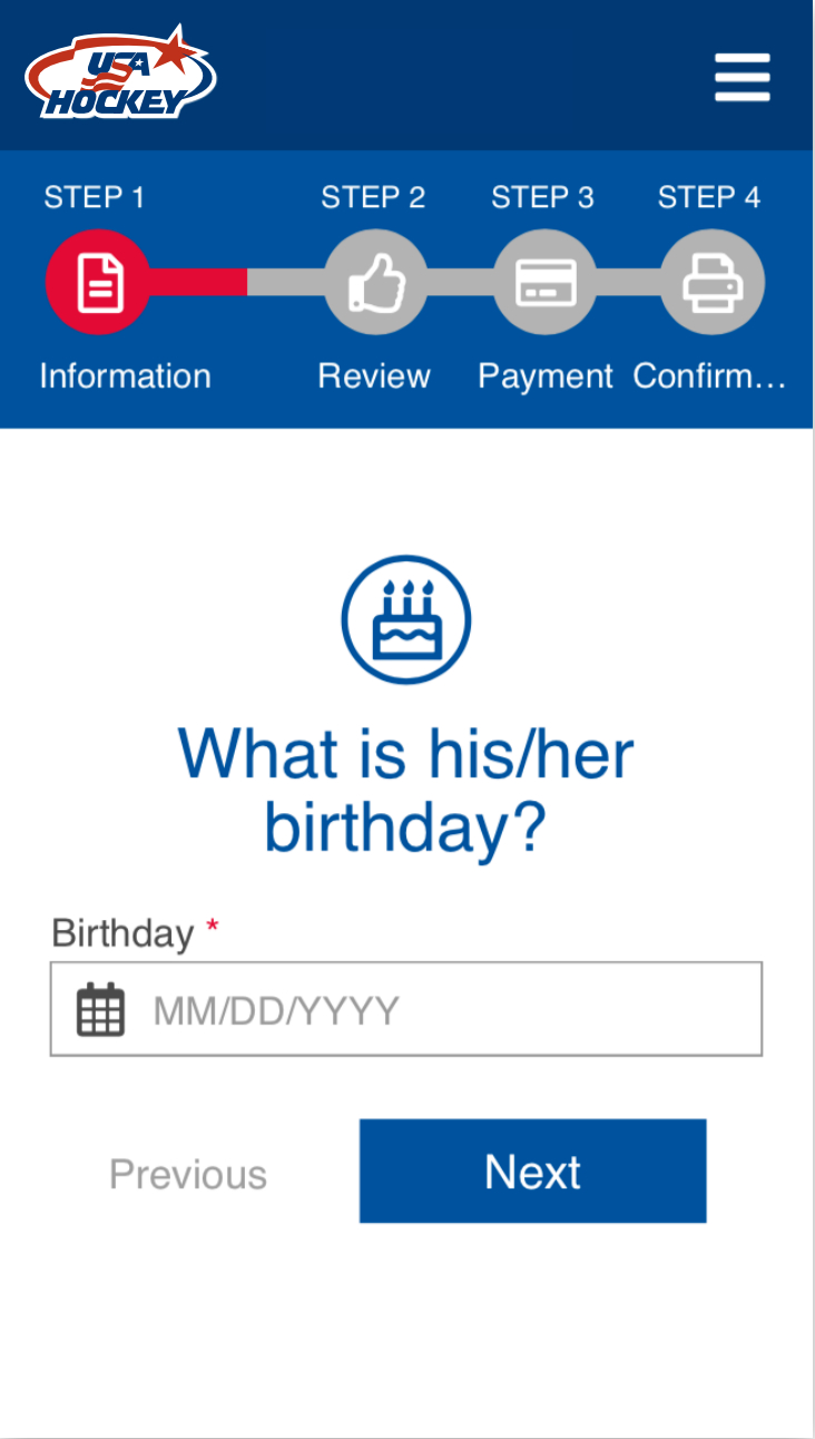
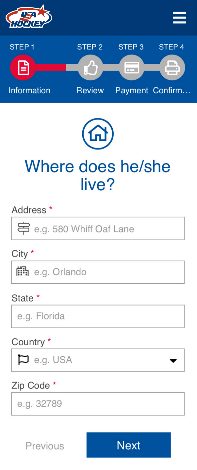
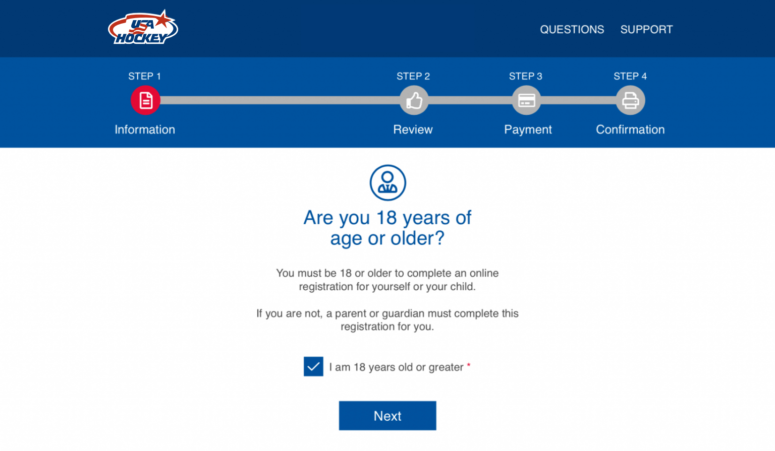
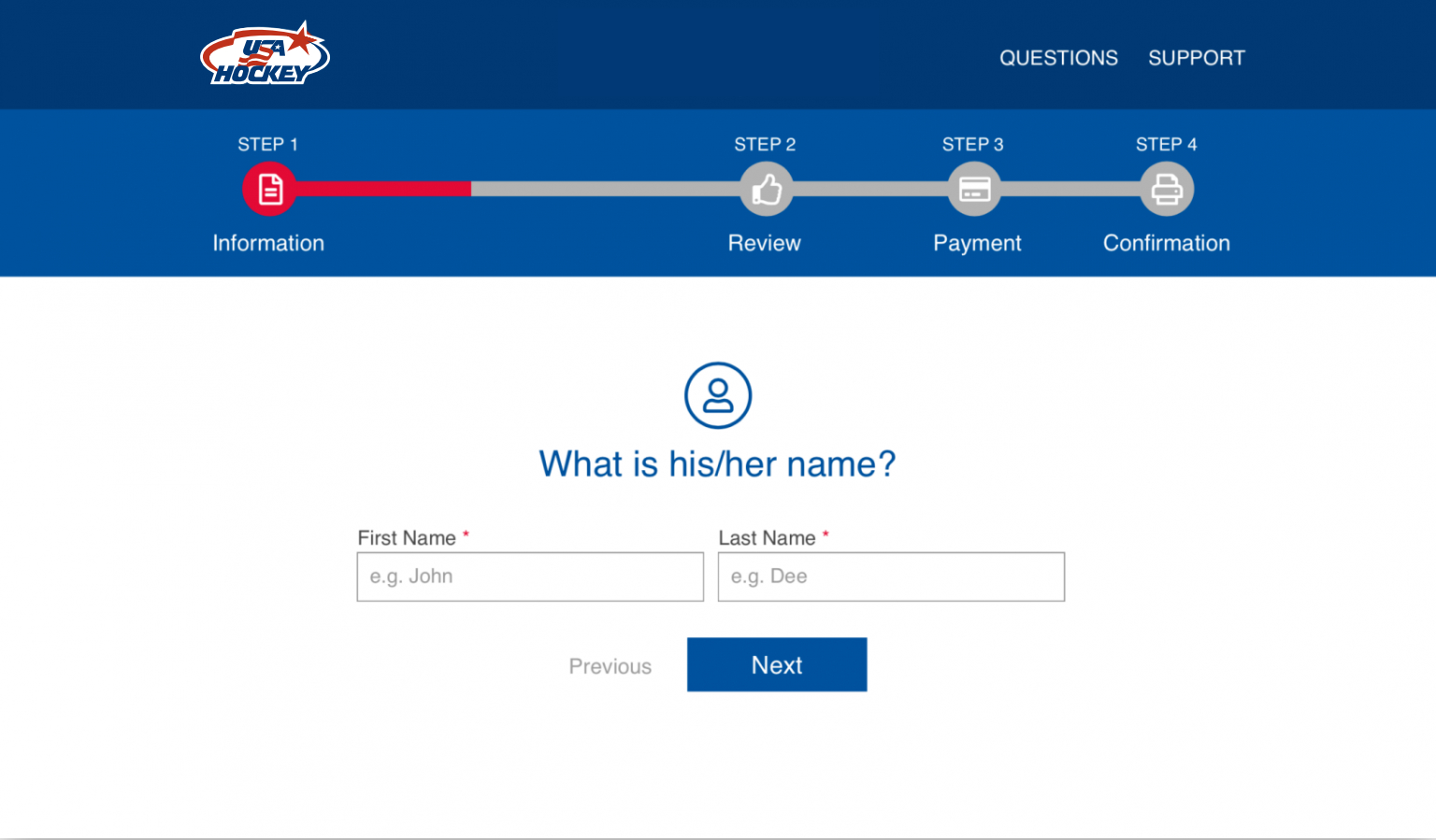
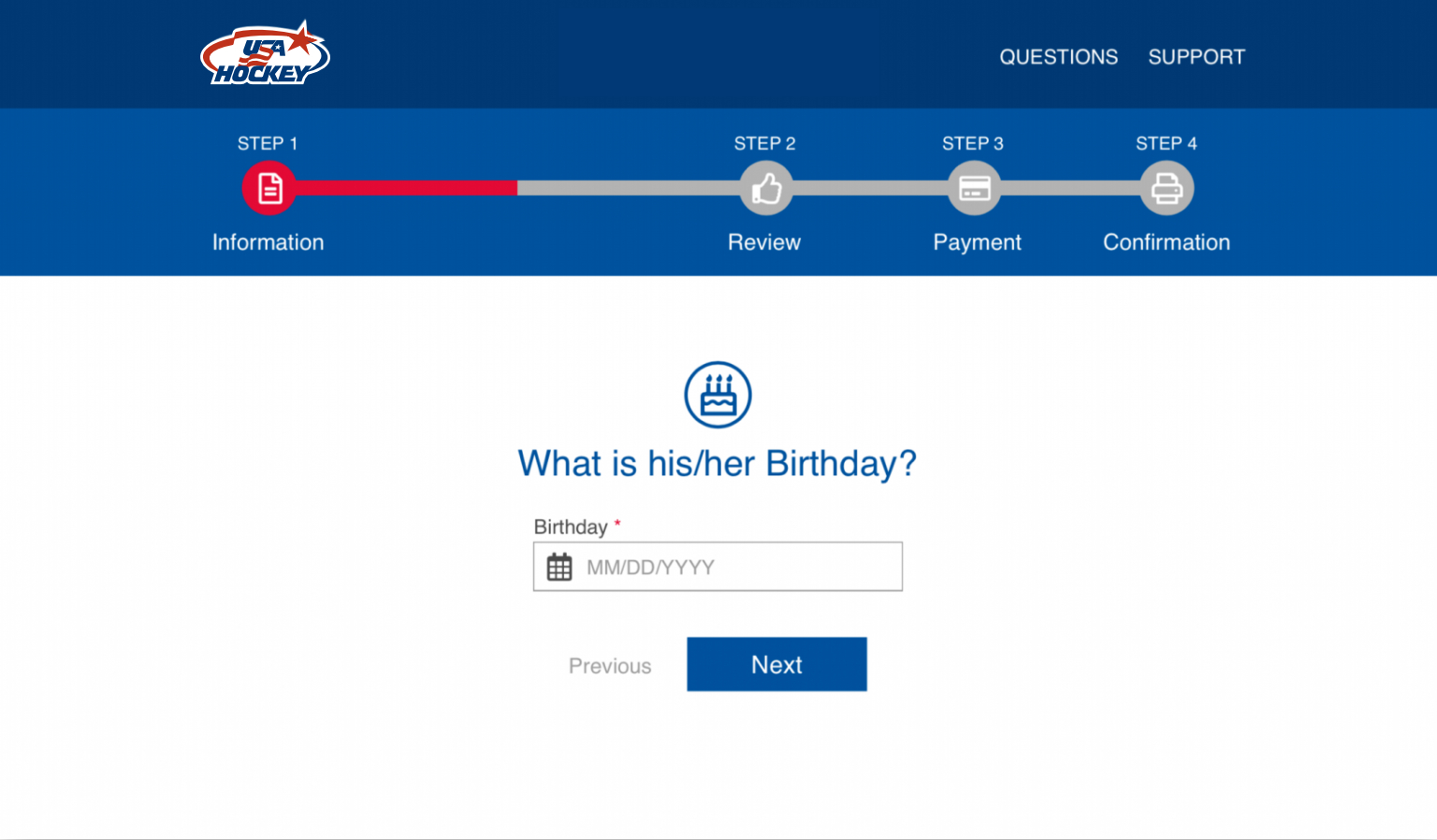
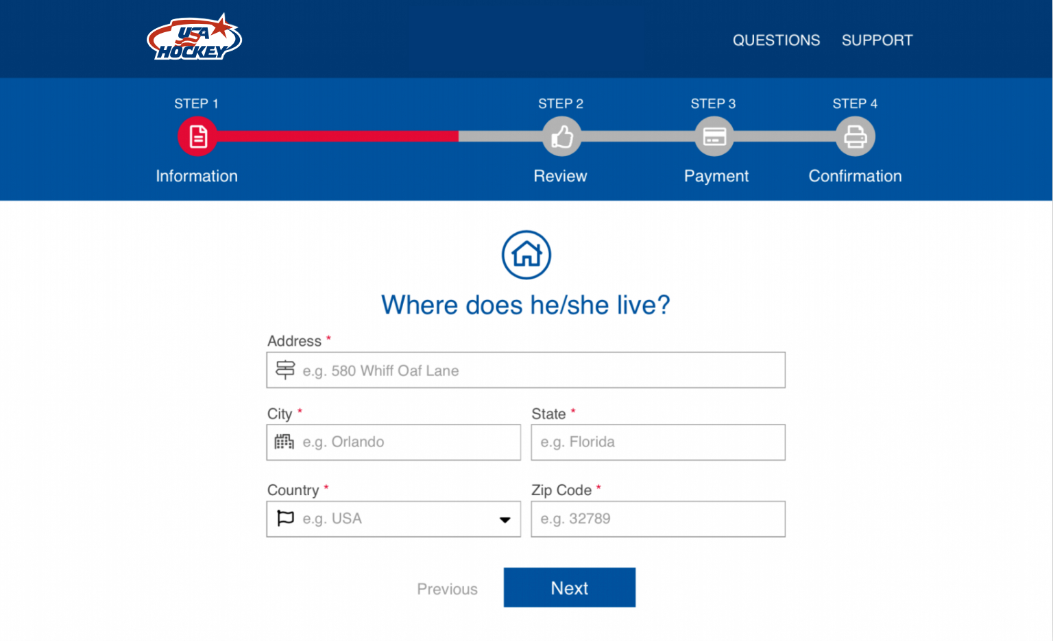
A big part of our users are adults and elders and they are not that familiar with technology. I noticed that they would prefer to do the registration face to face because somebody would just asked them the questions one by one. Therefore I tried to emulate that experience in the form by breaking the big form in small sections, that section with a familiar question like “what is your child’s name?” Instead of plain label like “enter name”.
I tried to avoid unnecessary fields to reduce the length of the form, however the required fields were still many. So I proposed these 3 ideas to reduce the feeling that it takes a long time:
Progress bar
When the user does not know how much is left, there is a feeling of uncertainty and despair, therefore it gives the feeling of taking longer. A progress bar would give the user the sensation of moving instead of feeling stocked in endless questions, also would give them an idea of how long it would really take.
Step by step
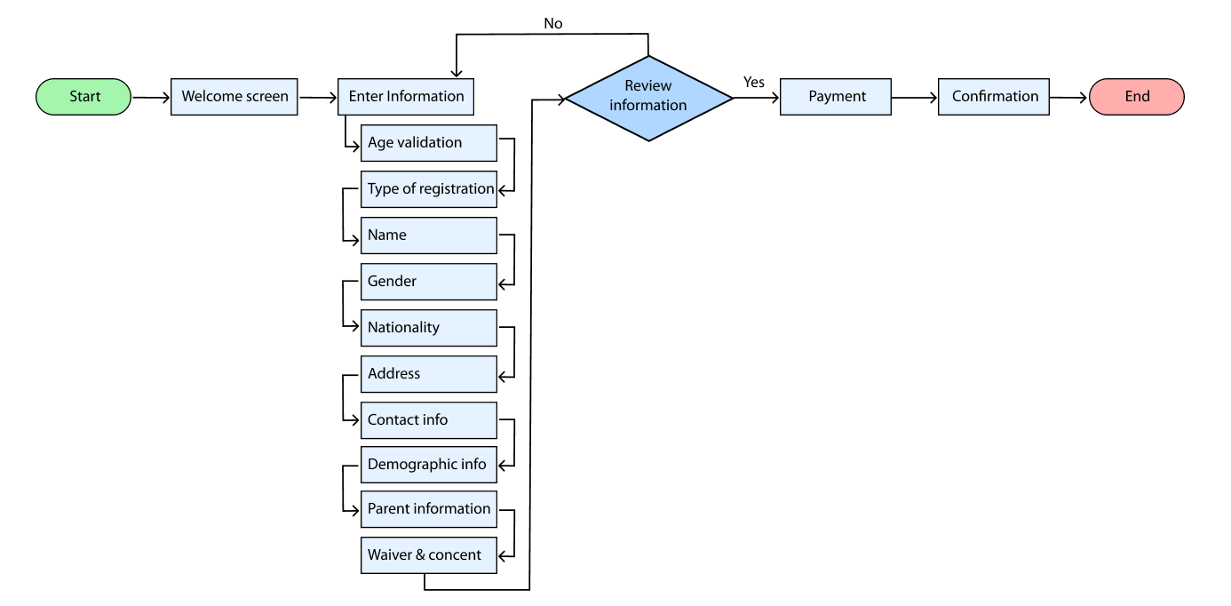
To avoid the user feeling overwhelmed or getting lost in a very large form, I also proposed baking the form in small sections of maximum 6 fields, similar to a wizard guiding the user step by step.
Adding Icons
Icons would even help to identify faster what is the section of fields about, for example to put a house icon when asking for the address, a cake for the date of birth.
User flow
Information architecture
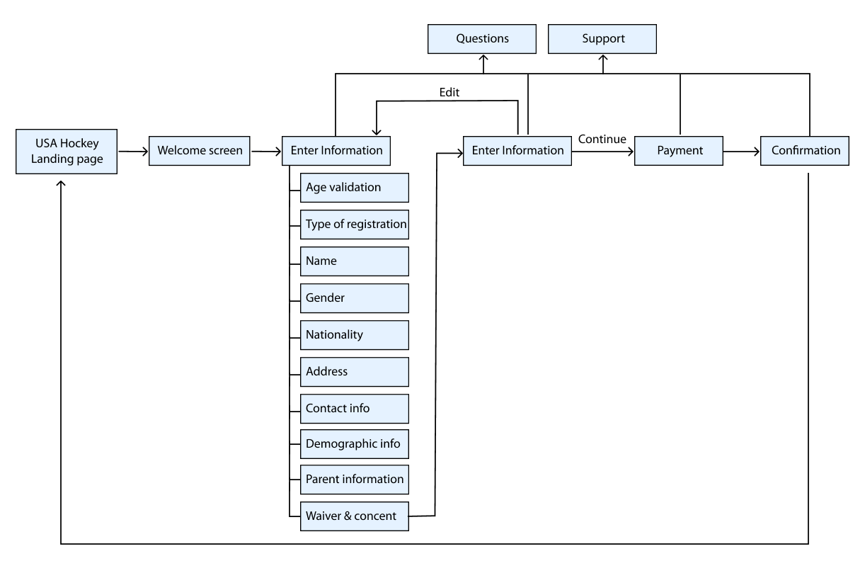
Accesibility
To make the form more accesible, this are the areas I identified that apply and I considered them in the design and the templates creation.
- Mobile-Friendly Layout:
- Large Tap Targets
- Clear and Concise Labels
- Semantic HTML
- Focus Styles
- Progressive Disclosure
- High Contrast
Design process
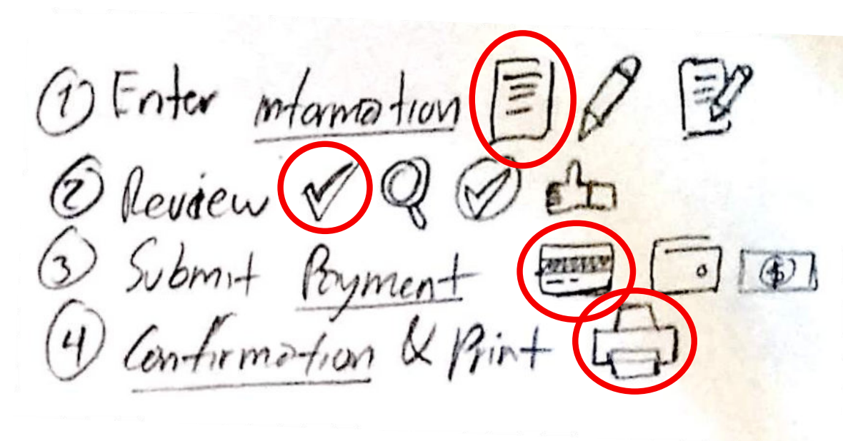
Exploring the icons
I was searching for icons to represent the four main sections, aiming to provide visual cues and enhance the overall appeal. I experimented with various approaches to depict the same concepts until I discovered what appears to be the most representative option.
Exploring the progress bar
I experimented with various types of progress bars, conducting research on similar UIs featuring progress bars to gather inspiration and identify common usage patterns. Eventually, I developed a custom solution that enhances user experience by enlarging the highlighted step, providing a more detailed indication of the user\’s progress. Given that the initial step, containing all the questions, is particularly extensive, I aimed to ensure users could easily track their progress as they navigate through the process.
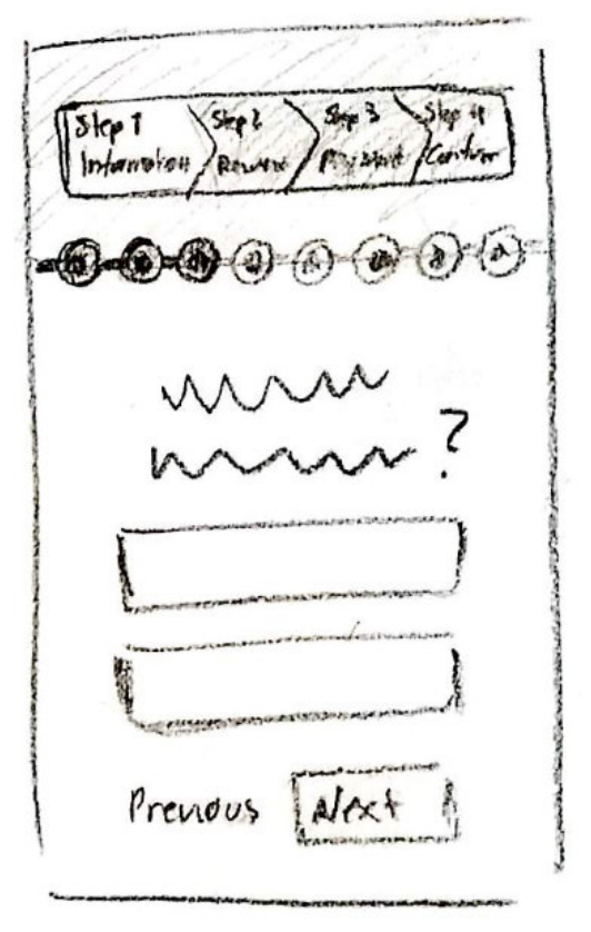
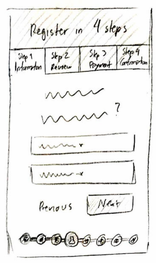
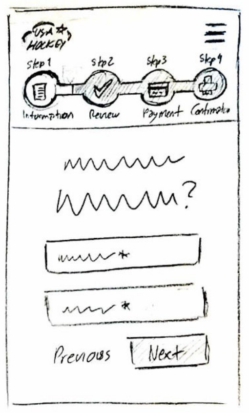
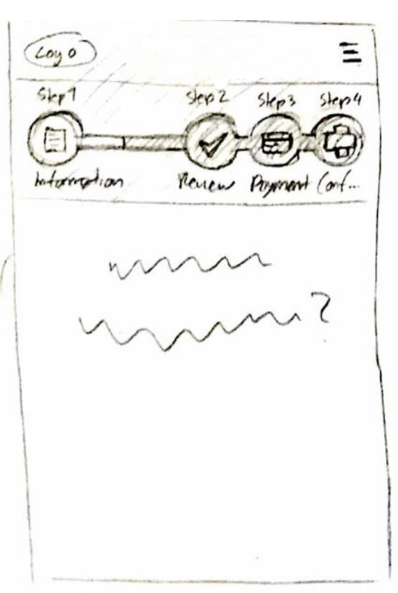
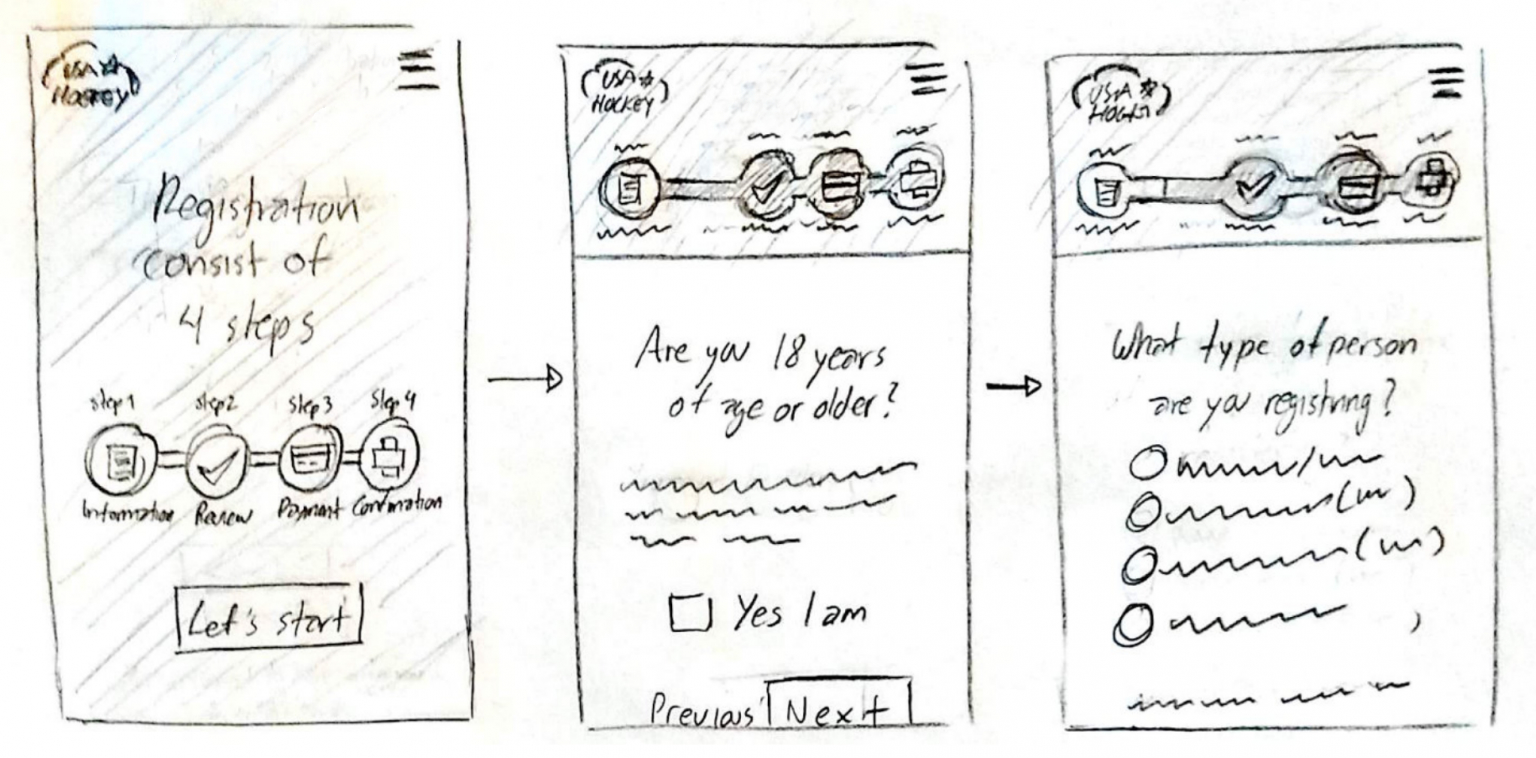
Exploring breaking the form to step by step
It may seem more efficient to have all the questions on a single page to optimize space utilization. However, in this case, I proposed dividing the form into sections to enhance the user experience, despite potentially increasing the number of clicks required. This approach organizes the fields by topic, enabling users to focus and reducing the feeling of being overwhelmed.
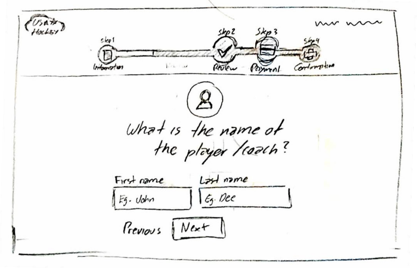
Exploring the desktop view
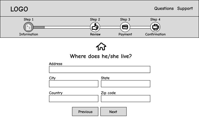
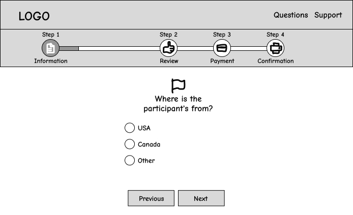
Although mobile devices was the main focus, it should still work in desktop. In this wireframe I was trying to confirm that indeed the same layout was still useful for desktop, it would just need to adjust widths according to the size of the screen.
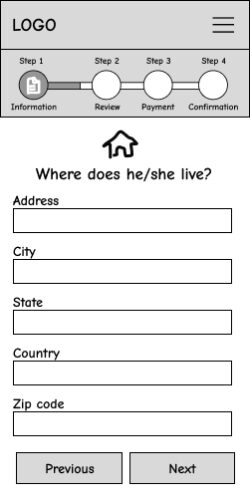
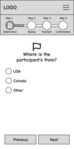
Clean wireframes
To test how everything look distributed in real sizes before applying final colors and icons I created some screens in wireframes. I sent them to my phone to test the sizes and spacings and overall how it feels, I did the same for laptop. I used them also to present progress to the client from whom received very positive feedback.
Testing and Iteration
I made a couple of high fidelity mockup putting together everything explored in the previous phase. Then I sent an email to some of the registrants, I attached the version 1 mockups and asked for their opinion. I didn\’t send a form or a set of questions because I wanted them to be able to express freely.
After receiving the feedback from the version 1, I continued working in version 2 and repeated the process of sending another email, this cycle continued until version 3 where the feedback was mostly positive.
Below is the mockups for each version and its feedback:
Version 1
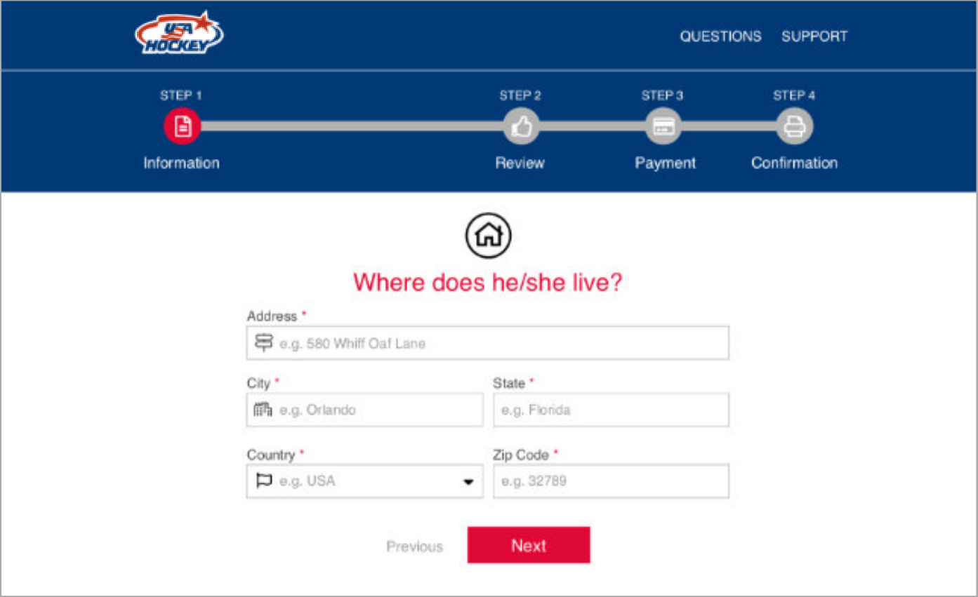
Sample size: 20
Feedback:
- The users like the progress bar.
- The users like the text sizes.
- The users like fields by step by step and friendly questions.
- The users like the icons.
- The users think the blue looks boring.
Version 2

Sample size: 17
Feedback:
- The users feel to read the question is red is annoying.
- The users think the red button means something dangerous.
- The users like black but think has nothing to do with USA Hockey brand.
Version 3
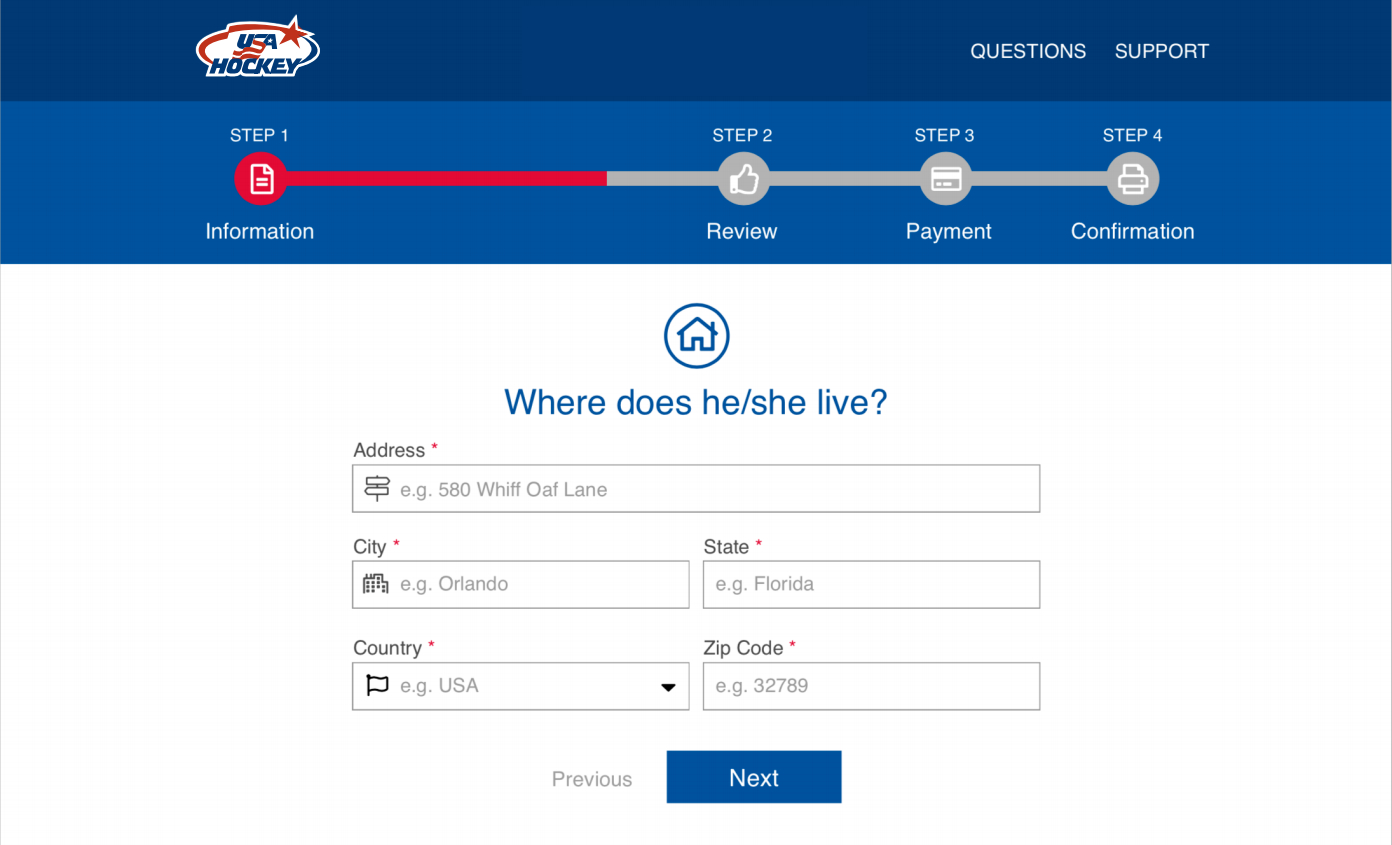
Sample size: 10
Feedback:
- The users think the design is clean and contemporary
- The users feel the colors are friendly, fresh and represents USA hockey brand.
- The users like the question and the button in blue.
Final outcome
Mobile version
Desktop version
HTML & CSS templates
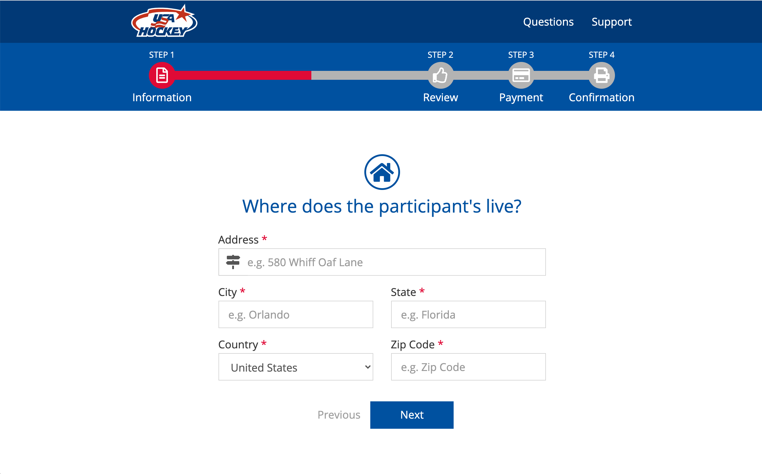
I created HTML & CSS templates for two main purposes:
-
Prototyping: In the absence of popular tools like Figma at that time, I used this templates and made them clickable using jQuery. I shared the prototype with users to validate before the final implementation. It was fully responsive however still not able to save any data to the backend yet.
-
Development: The same templates were provided to the development team to ensure pixel-perfect implementation and the right responsiveness.
You can view the templates yourself. They are clickable. Just be aware that only some screens are available in this demo. Try resizing the window to see the responsiveness, and observe how accurate it is to the mockups.
Validation
User testing
I contacted some of the users to participate on a brief video call using Google Hangouts to present them the HTML & CSS prototype. I had 10 users participating, I recorded the session and asked them to try to complete the form and to share their thoughts and comments with me as they were progressing.
Also at the end I asked them about the main 3 pain points we had, and the overall satisfaction, the results are listed below:
Survey results
The 3 pain points got solved and the overall satisfaction improved drastically.
Overall satisfaction
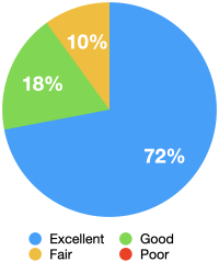
1. Good text size
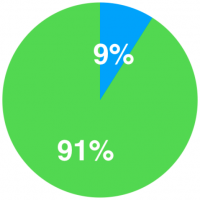
9% said:
The text is very small
2. Mobile friendly
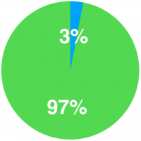
3% said:
It doesn’t work in phone
3. Acceptable timing
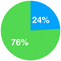
24% said:
The registration takes so long
Objectives
1. Improve Accessibility: Develop a user-friendly registration platform accessible across devices, with a focus on mobile phones.
2. Enhance User Experience: Simplify the registration process to reduce stress for users while ensuring essential information is collected.
3. Increase Efficiency: Optimize the platform to streamline registration and administrative tasks for users and administrators.
4. Foster Engagement: Create a seamless and engaging registration experience to encourage increased enrollment.
Requirements
1. Responsive Design: Ensure the platform is functional across devices, including mobile phones.
2. Simplified Interface: Create an intuitive and streamlined registration process.
3. Essential Fields: Retain necessary information while minimizing user friction.
4. Mobile-Friendly: Optimize the platform for use on smartphones and tablets.
5. User-Centric Approach: Prioritize user feedback to iteratively improve the registration process.
