CSP 2.0
Oil & Gas Company’s Customer Support Portal
About the project
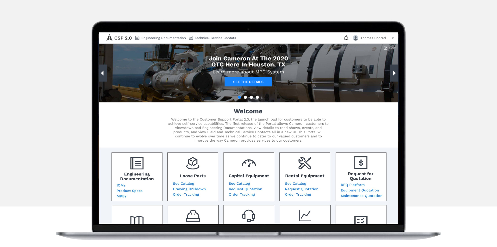
CSP is the Customer Support Portal for an important Company in the Oil & Gas field. Version 1 of the portal was developed previously by another team. I helped the planning and development process of version 2.
The Problem
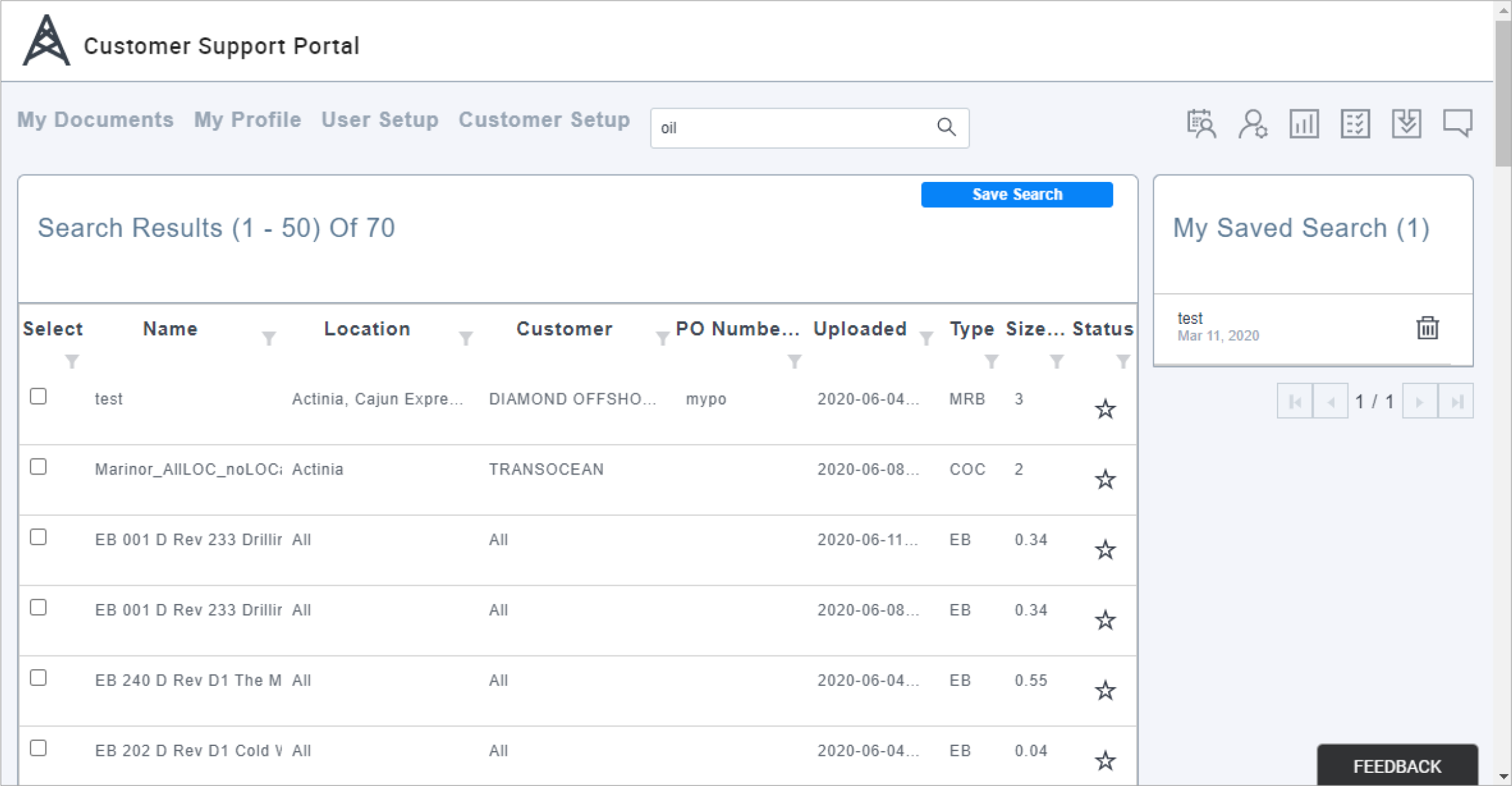
Since version 1 was focused only in documents which by the way the performance was very slow and had a poor user interface, the customers were frequently complaining and also requesting for more content to be available.
The Solution
A clicking prototype with a better user interface which includes lots of new features identified after several interview sessions with potential users. Also a the list of top 5 features to be included as MVP (minimum valuable product) and the delivery of pixel perfect and responsive HTML & CSS templates for its implementation to ensure the final product looks exactly as the prototype.
Previous Version
The Process
User Interviews
We had several sessions with existing users to interview them and understand their needs, pain points, and what would you like to see.
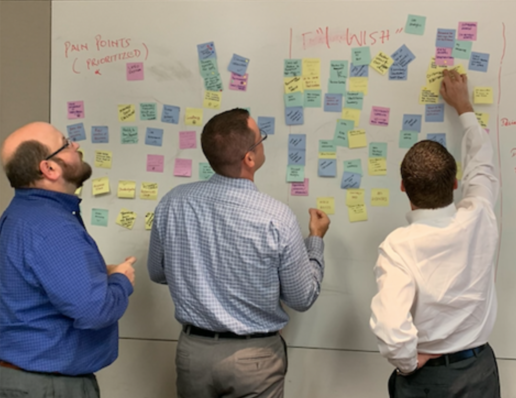
During a workshop we ask them to asked them to write the pain points in post-its and put them in the left side of the board, and what they wish in the right side. Below are the results of such exercise:
Top 3 Pain Points
- Slow performance
Improve speed to access data - Not intuitive navigation
Organized and easy to navigate - Content is spread in different portals
One same portal for everything
Top 3 I Wish
- More features
Several new features where mentioned such as: Events calendar, Marketing material - Standardization
Keep a standard look and feel in portal, consistency in look and feel and interaction - Customized Access
(My Documents, My Favorites, My Dashboard)
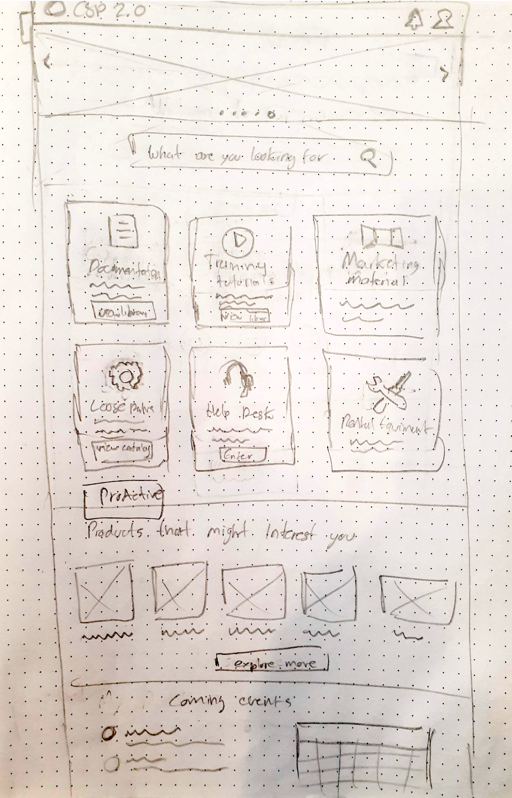
Sketch Exploration
After interviews with the stakeholders, they expressed they wanted to have a landing page since version 1 did not have one, so it feels more like a portal.
Also the usage of it is consistent with other portals of the company.
Also considering the users interviews I started the first exploring phase with pencil and paper quick sketches.
Wireframes
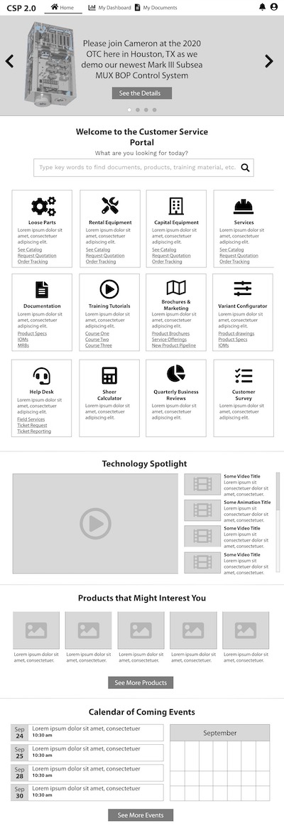
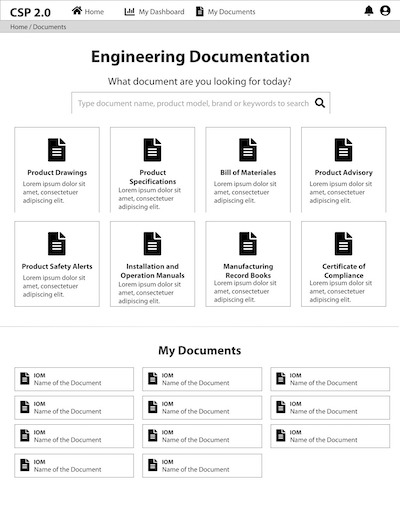
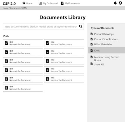
In order to represent visually all of the information obtained during the conversations with the users and the stakeholders, I created a set of wireframes which show to some of the people interviewed.
The reaction was pretty positive, they liked to see their feedback taken in consideration, for example:
- Banner to highlight events, new products and news to the customers
- Sections requested as tiles
- User content (My Dashboard, My Documents)
- Calendar events
Mockups
Then the next phase was to create hi-fi (high definition) mockups in order to show the stake holders and the customers a realistic image.
I reviewed the company’s documentation in order to follow the design guidelines which included font styles, iconography and the restriction in colors allowed which are blue and gray scale tones.
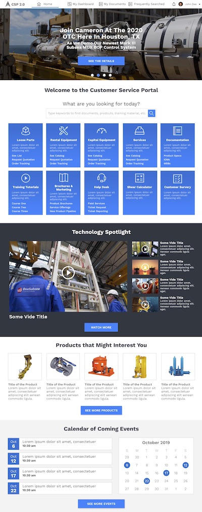
There was again very positive feedback, however some of the things to improve were:
- Blue tiles are hard to read
- Nav bar looks crowded
- Welcome message
- Search box in the nav bar so it is in every screen
- Reduce the banner height
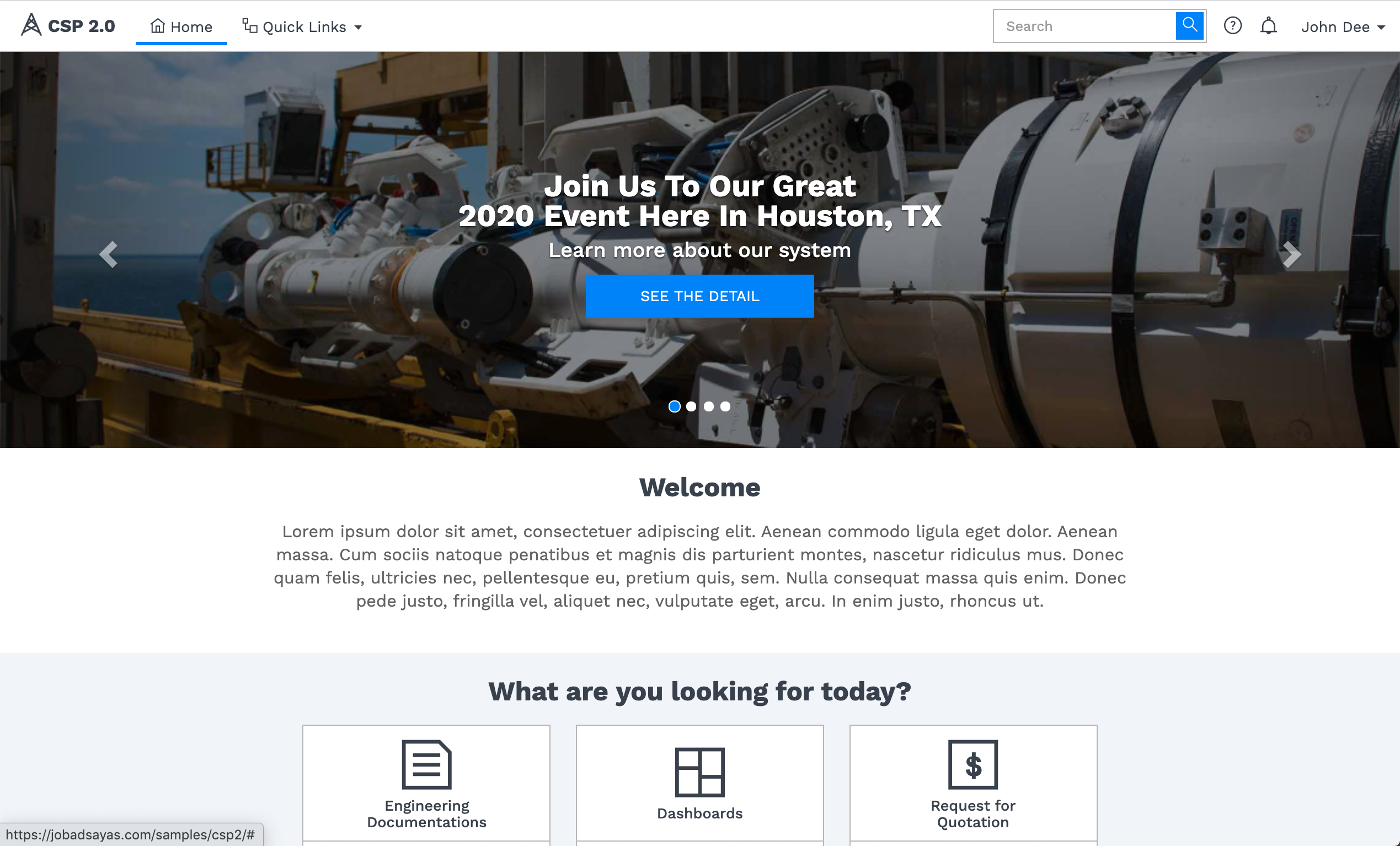
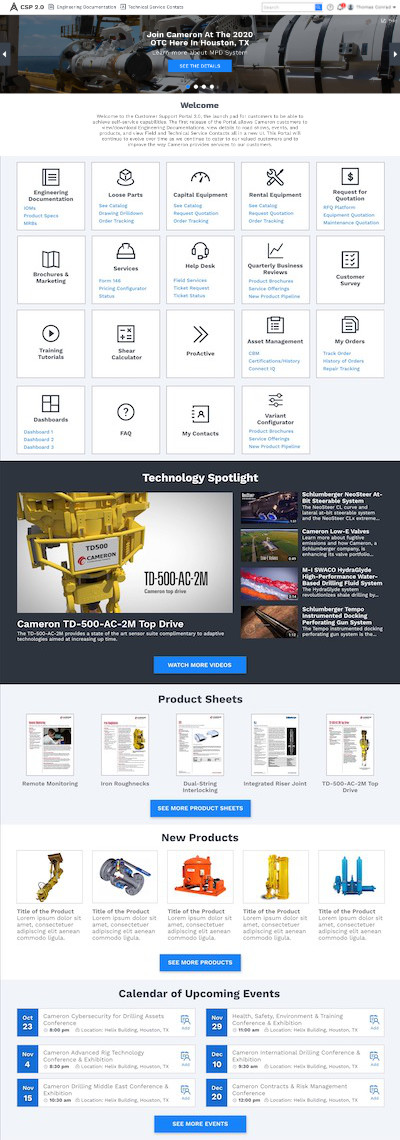
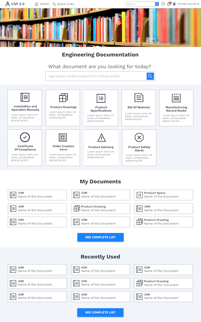
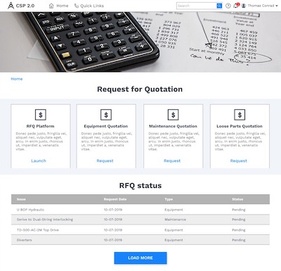
This is the landing page after several rounds of feedback. Also I explored the main screens for most of the tiles to define the flow and ensure that the look and feel and the experience is consistent.
Clicking Prototype
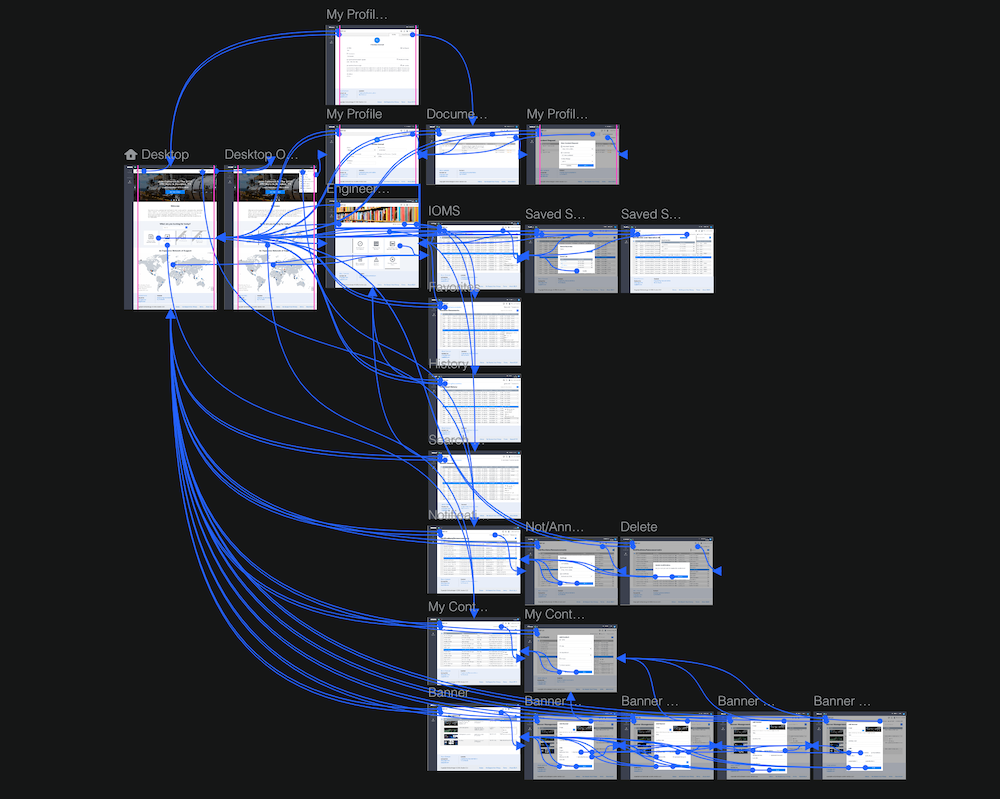
The next phase was the creation of a clicking prototype that we used with multiple purposes. First of all to show users and stakeholders to validate we met their needs.
Also for the development phase in order to explain the developers the screen flows and functionality.
Once the priorization of features for MVP (Minimum value product) were defined using the information gotten from the interviews with users, I created a clicking prototype before implementation.
Click the button below to see the clicking prototype of MVP. A new tab will be opened in your browser. Once loaded, by clicking anywhere the clickable areas will be highlighted so you can explore the prototype.
HTML & CSS template
Take a look by yourself to the HTML & CSS templates I created for implementation. I was in charge of creating every single template. I also coordinated the UI development team for its implementation in Angular, I also worked in some of the tasks and reviewed every single implementation, and corrected misalignments to make sure that the end product had a good quality and sticked to the mockups.
Try resizing the window to see that in deed it is fully responsive and adaptable for mobile devices.
